StyleX: A Styling Library for CSS at Scale
November 11, 2025
StyleX is Meta’s styling system for large-scale applications. It combines the ergonomics of CSS-in-JS with the performance of static CSS, generating collision-free atomic CSS while allowing for expressive, type-safe style authoring. StyleX was open sourced at the end of 2023 and has since become the standard styling system across Meta products like Facebook, Instagram, WhatsApp, Messenger, and Threads, as well as external companies like Figma and Snowflake.
At its core, StyleX is a compiler that extracts styles at build time and generates a static stylesheet. But it’s also a philosophy: a framework for authoring, sharing, and maintaining CSS at scale. StyleX makes styling intuitive for everyday engineers by imposing constraints that encourage predictability, enable composition, and scale effortlessly across teams and codebases.
How Do We Build CSS at Scale?
To understand the purpose of StyleX, let’s look at the history of CSS at Meta. Serving CSS at such a scale resulted in collisions across bundles, difficulties in managing dependencies between stylesheets, and challenges in reconciling competing rules that frequently led to specificity wars. Engineers resorted to complex selectors and !important tags, making styles brittle and hard to maintain. Large, monolithic CSS bundles meant browsers were downloading hundreds of kilobytes of unused rules on every page load, slowing rendering and interaction.
To address these issues, Facebook built cx, a CSS-modules-like system that linked local CSS to JavaScript. cx resolved issues with namespace collisions and dependency management but remained limited to static styles defined in separate files.
// ComponentName.css; class uses ComponentName/namespace syntax
.ComponentName/header  margin-top: 10px );
Styling at a Distance
As mentioned, StyleX is a system for styling components. Elements are styled using classnames. Global and complex selectors are disallowed to avoid styling at a distance: rules that affect elements indirectly from elsewhere in the DOM. Global baseline rules like element selectors or CSS resets must be defined in a separate stylesheet. This is to minimize indirect styling and promote encapsulation of styles.
/* Unsafe: styles leak to child elements rather than being explicitly applied */
.csuifyiu:hover > div  ...
/* Safe: styles are scoped to a specific element based on observed state */
div:hover > .ksghfhjsfg  ...
However, we do allow observing from a distance using the stylex.when APIs. This API provides a suite of relational selectors to style a component based on the state of its ancestors, descendants, or siblings. Observed elements must be marked with stylex.defaultMarker(), ensuring styles remain directly applied while supporting contextual behavior.
const styles = stylex.create(
    foo:
      backgroundColor:
        default: 'blue',
        [stylex.when.ancestor(':hover')]: 'red',
      ,
    ,
);
<div ...stylex.props(stylex.defaultMarker())>
  <div ...stylex.props(styles.foo)> Some Content </div>
</div>
Preserving CSS Features
StyleX preserves most of the CSS feature set (media queries, pseudoclasses, keyframes, and more) through static transforms at build time. Wherever possible, we mirror native CSS behavior so styling feels expansive and familiar.
While StyleX is built around static compilation, it also supports dynamic styles. When a value isn’t known at build time, the compiler emits a CSS variable reference, and the runtime writes it inline through the style prop.
const styles = stylex.create(
    // Height is unknown until runtime
    foo: (height) => (
      height,
    ),
);
//  .d-height var(--height), style: --height: height
<div ...stylex.props(styles.foo(height))/>
Theming APIs like stylex.defineVars() and stylex.createTheme() allow users to create and mutate shareable design tokens. defineVars() creates a variable grouping, and createTheme() allows users to create variants by redefining variable groups at a higher specificity.
/* const spacing = stylex.defineVars(sm: 2px, md: 4px, lg: 8px) */
:root, .sp-group--sp-sm:2px;--sp-md:4px;--sp-lg:8px;
/* const desktopSpacing = stylex.createTheme(spacing, sm: 5px, md: 10px, lg: 20px) */
.sp-dktp.sp-dktp, .sp-dktp.sp-dktp:root--sp-sm:5px;--sp-md:10px;--sp-lg:20px;
stylex.defineConsts() allows users to define shareable constants and media queries without overloading browser memory with CSS variables. During compilation, StyleX gathers metadata across all defineConsts() calls, generates placeholder hashes in create() calls, and inlines the constant values directly into the generated stylesheet.
Finally, APIs like stylex.keyframes() and stylex.viewTransitionClass() support animations by generating @keyframes and ::view-transition-* rules.
Predictability
StyleX is a system for styling components. We discourage global styling in favour of applying localized classnames on elements directly. Our design is centered around predictable style merging: The last style always wins! You can think of the stylex.props function as a deterministic merge of style objects: given stylex.props(styles.foo, styles.bar), bar always overrides foo. This makes it easy to share and combine styles predictably across files.
CSS specificity follows a hierarchy where selectors are assigned different priorities. The calculation is based on a three-column value of IDs, classes, and types, commonly written as, (ID, Class, Type). Because StyleX is entirely class-based, resolving conflicts between style objects means determining which class names to apply and enforcing priorities between them.
const styles = stylex.create(
  foo:  color: 'red', margin: 0
  bar:  color: 'black', marginTop: 10
);
function MyComponent()
  // becomes <div className="c-black m-0 mt-10" />
  return <div ...stylex.props(styles.foo, styles.bar) />
During merge, repeated properties across style objects are deduplicated so that only the last value is applied. As a result, each class name in the DOM node corresponds to a single property. In the above example, the color: red class is dropped during merge so color: black takes precedence. But resolving overlaps between shorthands and constituent longhands is more complex.
Consider the following HTML:
<style>
.margin-top-10  margin-top: 0px
.margin-10  margin: 10px
<style/>
<div class="margin-0 margin-top-10" />
When multiple classes are applied on a div, the resulting styling is based solely on the specificity of the selectors (in this case, the order of the classes). Without additional handling, margin overrides margin-top here completely!
Throw pseudoclasses and media queries in the mix and things become even more complex:
   [ "m-0",  "css": ".m-10 margin: 0" , 3000 ],
   [ "mt-10",  "css": ".mt-10 margin-top: 10px", , 4000 ],
   [ "mt-10-mq",  "css": "@media (...) .mt-10-mq margin-top: 10px ", , 4200 ],
   [ "mt-10-mq",  "css": "@media (...) .mt-10-mq:hover margin-top: 10px ", , 4320 ],
To handle this ambiguity, we compute a numerical priority alongside each CSS rule. We use these priorities alongside a user-configured styleResolution to determine the specificity of each class selector using the @layer at-rule or equivalent polyfill.
The enforced ordering looks something like this:
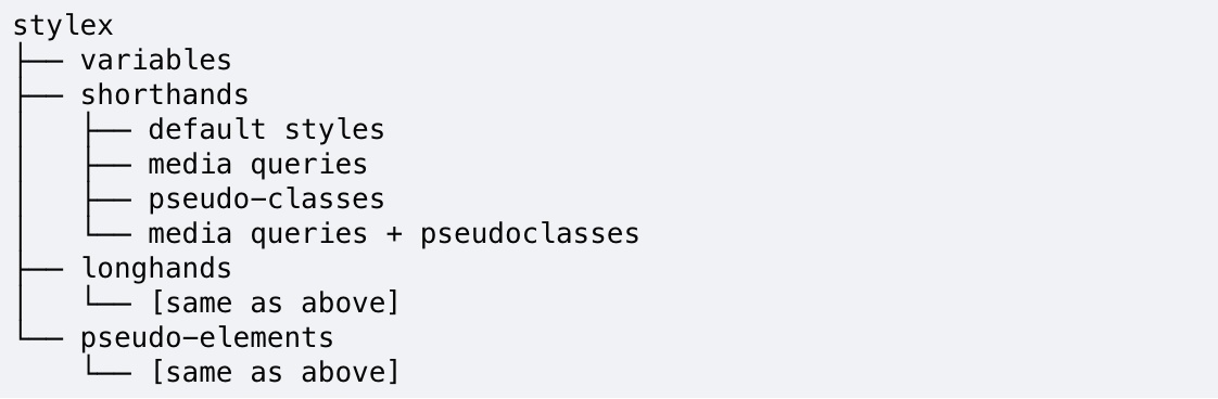
The result? Longhands and shorthands merge predictably, :active states override :hover states, media queries override default behaviour, and user-authored order is respected when possible. This behind-the-scenes specificity handling allows developers to combine and reuse styles without manually resolving conflicts.
Looking Forward
StyleX is maintained by a team of CSS enthusiasts who aim to make styling accessible to everyone. Beyond the compiler, the monorepo includes an ESLint plugin for style validation, a CLI for easy stylesheet generation, a PostCSS plugin for post-processing, and an experimental CSS parser.
The open source community has been critical in shaping the direction of StyleX. With the help of thousands of contributors, the ecosystem includes a community-built playground, VS Code extensions, an SWC compiler, multiple bundler integrations, and more!
We’re always exploring new ways to make StyleX the styling system for the modern web. Our work is an ongoing dialogue between the needs of the community and the values that guide our design. Roadmap highlights include an API for shareable functions, LLM-ready context files, support for inline styles, developer extensions, strict compiler validation, logical styles utilities, and an official unplugin for bundler integrations. Our goal is to continue to evolve alongside the browser and keep imagining what styling on the web can be.
Happy style authoring! We make StyleX for you.
Learn More
To hear the latest on StyleX, check out the StyleX website, GitHub, Bluesky and X.
To learn more about Meta Open Source, visit our website, subscribe to our YouTube channel, or follow us on Facebook, Threads, X, Bluesky and LinkedIn.
Acknowledgements
Special thanks to past maintainers Naman Goel and Sebastian McKenzie; contributors Frank Yan, Jerry Su, Ankit Sardesai, Joel Austin, Daniel Neiter, Nicolas Gallagher, Vincent Riemer, Ezzudin Alkotob, Andrey Sukhachev, Nitish Mehrotra, Nadiia D., Prakshal Jain, JC Pérez Chávez, Samantha Zhan, Chang Yan, Anay Bhakat; advisors Christopher Chedeau, Chris Callahan, Richard Hansen, Robert Maratos, Ricky Li, Andrew Imm, Tim Yung, Eli White; Modern CSS leads; the Web Platform org; the open source community; and the lineage of systems like React Native and Linaria that continue to inspire our work.
Search
RECENT PRESS RELEASES
Related Post


