Visualizing The Pure Size Of Apple With A...
November 17, 2014
46 minutes ago

Visualizing The Pure Size Of Apple With A Chart
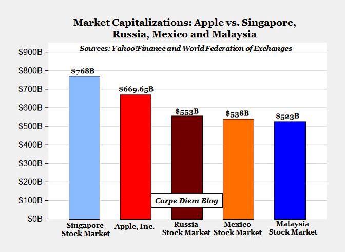
Apple is the world’s largest company. It’s up 43% this year and its market cap continues to climb — now well above $670 billion. If Apple’s share price continues to appreciate at its current rate, its market cap could hit $1 trillion before the end of 2015.
Whoa.
The chart above puts Apple’s size into a unique perspective. It comes from Mark J. Perry, who first posted it at his Carpe Diem blog. His chart compares the total market cap of Apple to the total market caps of several stock exchanges around the world. These include the stock markets of Russia, Mexico and Malaysia.
Apple is bigger than all 3.
Yes, a single company is worth more than Russia’s entire stock market. In-fact, its bigger by more than $100 billion. This is a remarkable moment to marvel at the size of Apple. It’s also a unique view of the America’s powerhouse in technology.
Search
RECENT PRESS RELEASES
Related Post
