FALSE: This renewable energy graph is not accurate
March 29, 2025
This post on X (formerly Twitter) with a graph claiming to represent the global percentage of renewable energy use is FALSE.
The text accompanying the graph criticises renewable energy.
The graph claims to be based on data from three sources: Lomborg 2020; the International Energy Agency (IEA) ; and “Biden’s” Energy Information Administration (EIA) 2023.
However the graph looks exactly like one posted by Bjorn Lomborg, a well–known–climate change denier, in 2013. The IEA and EIA reports mentioned do not contain any such graph.
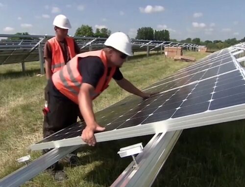
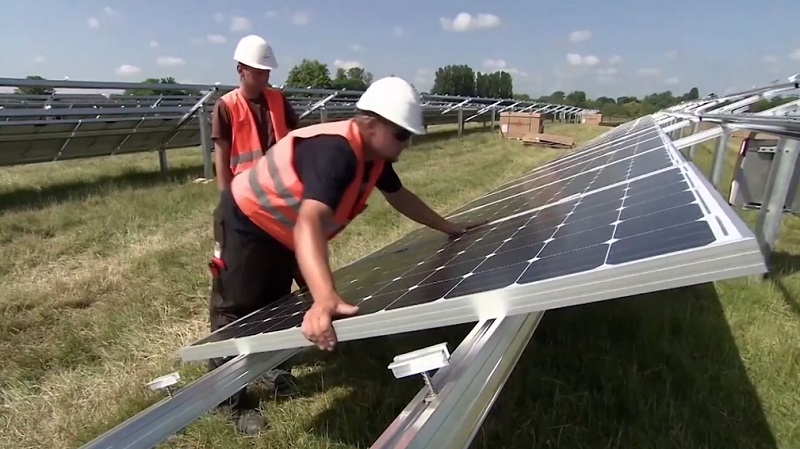
Renewable energy sources such as sunlight and wind are replenishable and cannot be depleted, offering a solution to mitigate climate change. In contrast, traditional power generation from burning fossil fuels releases carbon dioxide and other greenhouse gases, which contribute to global warming.
From 1800 to 1900, the world relied mostly on wood and coal for energy. By 1900, energy consumption was split roughly equally between coal and wood, making the graph inaccurate.
The United States illustrates coal’s rise during the 1800s industrial revolution, where it gradually dominated the energy mix. Similarly, the United Kingdom relied almost entirely on coal by the early 1900s.
Designating wood as a reliable energy source is controversial and depends on effective forest management to maintain carbon neutrality (here, here, and here).
To achieve carbon neutrality or net-zero emissions, an entity must balance carbon emissions with carbon removal from the atmosphere. This concept applies mainly to carbon dioxide but can include other greenhouse gases like methane and hydrofluorocarbons.
However, using wood from natural forests as fuel leads to deforestation, worsening global warming and climate change. This is a significant issue in Africa, where many still rely on biomass for energy (here, here, and here).
The graph does not accurately track renewable energy development. In the 1980s, renewables accounted for about 20 per cent of global energy, but this share grew rapidly after 2000 as countries invested in renewables to combat climate change.
Finally, the graph also undercuts the share of renewable energy at present by about half. From the claim, it appears that renewable energy accounts for about 15 per cent of the world’s current energy needs.
Renewable energy accounts for around 30 per cent of the world’s current energy demand, which is twice as much as the graph claims (here, here, here, and here). The amount of renewable energy differs between poor and rich countries, with a country such as Kenya, for example, gaining almost all its energy from renewable sources.
Because of these various inaccuracies, the graph in the claim cannot be an accurate depiction of renewable energy use.
PesaCheck has examined a graph of renewable energy and finds it to be FALSE.
Search
RECENT PRESS RELEASES
Related Post


