The Stock Market Just Did Something for the 2nd Time in 100 Years, and History Says What C
May 27, 2026
The past two months have been nothing short of incredible for the stock market. At recent prices, the Dow Jones Industrial Average is up 12% since March 30, while the S&P 500 (^GSPC +0.02%) is up 18.5%, and the tech-heavy Nasdaq Composite is up a whopping 28% as artificial intelligence (AI) euphoria reaches a fever pitch.
But as exciting as the rally has been, there’s a number that should give you pause: the Shiller CAPE ratio. The popular measure of how expensive the stock market is recently crossed 40 for just the second time in the last 100 years.
Here’s what that means for investors.
What the Shiller CAPE ratio actually measures
The CAPE, or cyclically adjusted price-to-earnings ratio, is basically a smoothed-out price-to-earnings (P/E) ratio for the whole stock market. It takes the price of the S&P 500 and divides it by the average of its inflation-adjusted earnings over the past 10 years.

Image source: Getty Images
A standard P/E ratio can be distorted by a single great year or a single terrible one, but smoothing earnings over a decade strips out the noise and gives you a cleaner read on how much investors are actually paying.
When the ratio is high, it means the market is expensive relative to what companies have actually earned. When it’s low, stocks are cheap in comparison. The historical average sits around 17, meaning the market is currently trading at more than double its long-run norm.
This is the highest the CAPE has been since the dot-com era
The only other time the CAPE ratio crossed 40 was in 1999, right at the peak of the dot-com market bubble. The S&P 500 had roughly tripled over the prior five years, driven by speculative enthusiasm for internet stocks that in many cases had no earnings at all.
Take a look at the CAPE over the last 100 years. Note: the data in the chart is slightly out of date, so the current reading above 40 isn’t yet reflected here.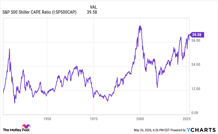
S&P 500 Shiller CAPE Ratio data by YCharts
What history says about future returns
When the CAPE ratio is this elevated, returns have historically been poor. Research from Robert Shiller himself — the Yale economist who created the metric — shows that when the ratio is above 30, average annual returns over the following decade tend to land in the low single digits.
Above 40, there simply isn’t enough data, but clearly, what exists isn’t encouraging. The dot-com parallels are hard to ignore.
Just like during the dot-com era, today we have a market driven higher by extreme enthusiasm for a transformative technology and a belief that “it’s different this time.” We have stock valuations stretched well past what could reasonably be justified and a market that is essentially priced for perfection.
What should long-term investors do now?
Now, this by no means guarantees a crash is imminent or that the correction will be on the scale of 2000, but it is a cautionary tale.
Still, as much as history here seems to suggest a repeat of 2000 is in store, we can’t know that with any certainty. And even if one is, you can be right about a crash and very wrong about when it comes, and the second question makes all the difference. Plenty of people predicted the dot-com bubble years before it actually burst, and they missed enormous gains in the meantime.
Timing the market is next to impossible, and trying to do so is risky. History’s most important lesson here is that over the long haul, patient, steady investing has always been the winning formula.
Search
RECENT PRESS RELEASES
Related Post