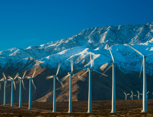
These Graphics Help Explain What Climate Change Looked Like in 2024
December 29, 2024
Telling the story of our lives—climate change—takes a lot of words. But sometimes, a graphic is what makes things click.
Whoever coined the adage “a picture is worth a thousand words” was likely not referring to a chart, a locator map or an infographic, but in many cases that’s exactly their value to the reader. I created or edited nearly 350 of them for Inside Climate News in 2024, including several in the past few weeks to put the year in context.
The effect is unnerving—but there are some hopeful signs, too.
Take a spin with me through the year in climate, as well as the graphics we published this year that really stood out.

The American Chemical Society calls this data “a powerful symbol of the human impact on the environment and the role of fossil fuels in global climate change.” Scientist Charles David Keeling discovered seasonal patterns in carbon dioxide levels while measuring them in the 1950s—and showed how they kept climbing year after year.

Most of the increase in the Keeling Curve is coming from the carbon released when we burn fossil fuels. With occasional pauses, that keeps rising. Despite decades of warnings about the consequences, countries still spend trillions of dollars subsidizing these fuels.

The United States, historically the biggest contributor to global warming, has reduced its CO2 emissions from fossil fuels in recent years. European countries are also bending that curve. But emissions in many developing countries continued to rise in 2024—and international shipping and aviation emissions soared. Developing countries have pushed wealthy nations to help with the costs of clean-energy transition, after contributing so much to the crisis that necessitates it.

As scientists remind us, reducing the consequences of climate change is a good idea no matter when we do it. But sooner is better for lives and financial wellbeing.

One potent example of climate change in action: what’s happening to the Arctic.

It’s easier to decarbonize electricity than some other sources of climate-changing pollution, like airplanes and farming. But while U.S. utilities have increased their use of renewables, they’ve often preferred to switch from coal to gas.

Here’s a climate bright spot: The batteries that help power the green transition are much, much cheaper than they used to be.
And here are some noteworthy graphics of mine from 2024:

Through his investigative coverage of a fatal mine explosion in Adger, Alabama, reporter Lee Hedgepeth got his hands on the Oak Grove Mine map and took photos of it. I stitched them together, “unfolded” the creases via Photoshop, layered the composite with online maps from ESRI and Google and built this house-by-house locator.
Many residents had no idea their homes were right on top of these mines until they read the series of stories by Hedgepeth and fellow reporter James Bruggers. Their reporting and my graphics garnered awards from the Society of Environmental Journalists.

Providing a locator map is great. Producing a visual explainer is also great. Pairing them into one graphic is ideal for the reader to get the whole picture in one image. So not only are we showing where fracking is happening, but we’re also explaining what fracking is, so reporter Katie Surma doesn’t need to in her story. If memory serves, this was a quick turnaround assignment so my cut-away is two-dimensional instead of my preferred 3D-style approach.

Reporter Dennis Pillion’s story on the dredging of Alabama’s Mobile Bay could have taken a basic locator map, which is valuable for readers to quickly know where the story is happening. But there’s more to the story, such as who is doing the dredging, why the dredging is needed, when the bay has been dredged in the past and what the dredging could mean to the environment. My favorite part was translating a disproportionate chart into a proportion-accurate diagram (at the bottom of the infographic).

Sometimes there’s breaking news that calls for an infographic, such as a pipeline rupture, a wildfire or some other environmental crisis. Other times it might be a piece of climate legislation that receives a deciding vote, approval or rejection. Such was the case of Navajo land in the Southwest being denied permits for pumped storage hydropower projects. Reporters Noel Lyn Smith and Wyatt Myskow brought their respective expertise to the table and co-wrote the breaking news story, and we determined an infographic would help tell the tale. Noel sent over a hydropower site map, and I pulled from my morgue a pumped storage diagram I had previously created with Wyatt. By marrying my locator map with my infographic, we were able to show the reader the bigger picture, all on deadline.

This one was fun to work on. It’s just a locator map, really, but it took some forethought. Summer fellow Bing Lin hiked an impressive length of the Pacific Crest Trail this summer, reporting on his trials and tribulations through the lens of climate change. We knew this was going to be a four- or five-part series, so I needed to make sure each of the accompanying locator maps were stylistically the same and each showed his starting and ending points on the trail (per chapter). Plus, I’m from Northern Nevada and I have a deep love for the area—and the Sierra Nevada in general—so mapping this was a delight.

This infographic for reporter Kiley Price is where we have a little bit of everything. Kiley’s story on whales getting tangled in the rope from lobstermen’s traps had a lot of moving parts: North Atlantic right whale population estimates. Where and how many of these whales have died due to entanglements and vessel strikes. What actions are being taken to minimize these events.
So here I tasked myself to tie it all together into one visual, which contains two separate locator maps, two charts and three whale-friendly options lobstermen can employ to harvest their lobsters. For good measure, I added an illustration of the whale itself, which draws the eye and instantly tells the reader what this graphic is all about.
About This Story
Perhaps you noticed: This story, like all the news we publish, is free to read. That’s because Inside Climate News is a 501c3 nonprofit organization. We do not charge a subscription fee, lock our news behind a paywall, or clutter our website with ads. We make our news on climate and the environment freely available to you and anyone who wants it.
That’s not all. We also share our news for free with scores of other media organizations around the country. Many of them can’t afford to do environmental journalism of their own. We’ve built bureaus from coast to coast to report local stories, collaborate with local newsrooms and co-publish articles so that this vital work is shared as widely as possible.
Two of us launched ICN in 2007. Six years later we earned a Pulitzer Prize for National Reporting, and now we run the oldest and largest dedicated climate newsroom in the nation. We tell the story in all its complexity. We hold polluters accountable. We expose environmental injustice. We debunk misinformation. We scrutinize solutions and inspire action.
Donations from readers like you fund every aspect of what we do. If you don’t already, will you support our ongoing work, our reporting on the biggest crisis facing our planet, and help us reach even more readers in more places?
Please take a moment to make a tax-deductible donation. Every one of them makes a difference.
Thank you,
Search
RECENT PRESS RELEASES
Related Post


